9 Unique Icon Styles for Great User Experience
Men who wish to know about the world must learn about it in its particular details © Heraclitus
During the course of my work on the new icon library for a design system, I stumbled upon tons of non-obvious and beautiful icons. I collected them and now decided to share my findings with you.
One thing that got me thinking was a line where an icon is no longer an icon and should be considered an illustration.
Atlassian Design shares this definition:
While illustrations bring a user into a narrative, capturing several ideas and telling a story, icons serve a more functional purpose. They represent content rather than complementing it. Generally, illustrations depict large thematic concepts using metaphor and narrative.
Icons, on the other hand, are much simpler and are better suited at depicting very specific concepts. Think of illustrations as paragraphs and icons as bullet points.
Some icons I am sharing are quite detailed and can be treated as illustrations, so I am leaving it up to you to decide which category they belong to.
There are certainly dozens of styles, yet in this article, I will talk about the ones I liked the most.
1. Line icons
Usually, black outline, 1 to 3 pixels, some parts of the icon are colored to make an icon brighter.
These icons make the website look classy and fit almost any style. From bigger icons:
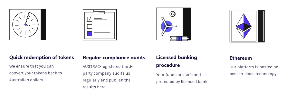
Icons by AUDT
…to smaller and simpler:
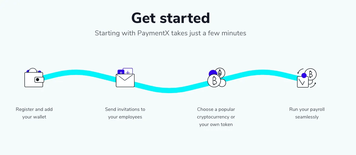
Icons by PaymentX
…or more detailed and classy:

Icons by checkout
💡 Idea
One great way to make an even simple icon a hit is to animate it.
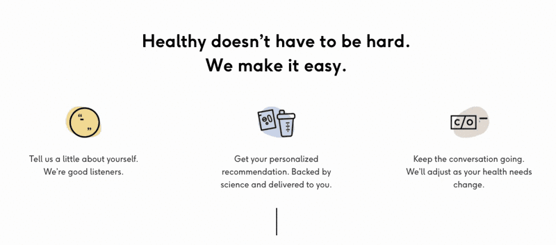
Icons by Care/of
Get some inspiration from Lordicon, animated interactive icon library:
❌ What to avoid
Let’s take a look at this icon set and see what could be done better:
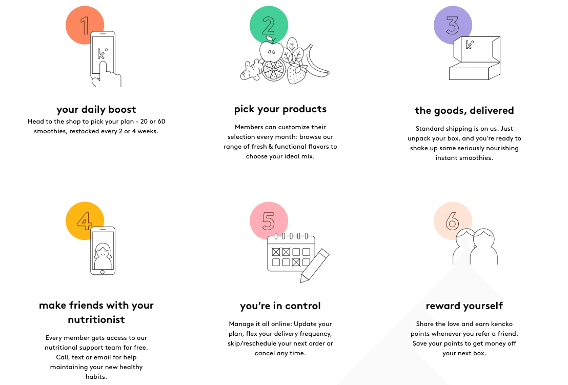
Icons by kenchko
Use the same perspective. Do not use a one-point perspective and two-point perspective icons nearby.
Check the level of details. Do not leave some icons minimalist and other super detailed.
Keep the icon weight in mind. Some objects visually occupy more space than others.
2. “Line + bright spot” icons
Just take a look at these bright and friendly illustrations:

Icons by Packlane
Adding bright spots can be an easy way to freshen up minimalist and standard icons.
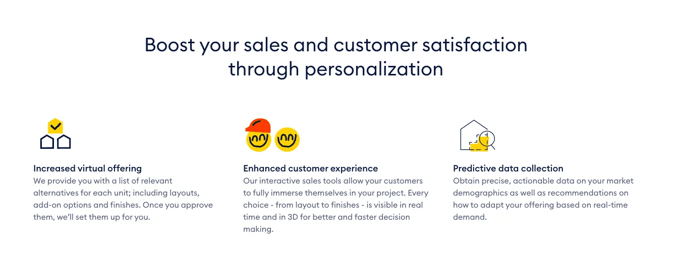
Icons by habx
3. Isometry
Isometric illustrations might take a lot of time, but the result is often well worth it.
Mimicking reality or creating an unrealistic magic world, it is all possible with isometric illustrations.
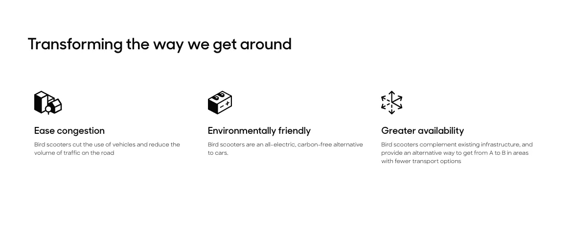
Much more, in this case, a company is creating isometric illustrations that follow the same style and therefore result in holistic user experience:
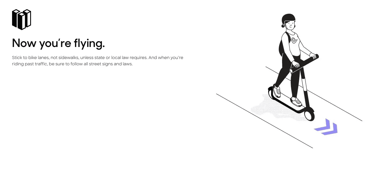
Icon and illustration by Bird
4. Abstract minimalist illustrations
Just a few lines and circles, and it is almost impossible to understand the meaning of the icons without a follow-up text.
At the same time, it’s hard to miss this illustration — it is just too bold, too eye-catching, and irregular in a good sense.
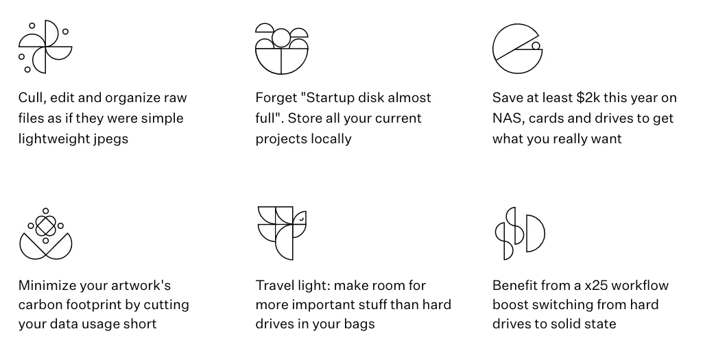
Icons by Rawsie
5. 3D icons
Being still quite an unusual way to represent some idea, 3d icons are not very complicated in creation. Often these icons look amazing on big bright blocks:
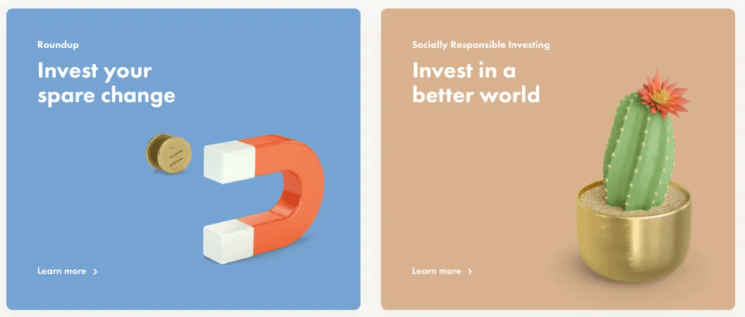
Icons by Wealthsimple
Enriching pricing plans design with some amazing 3D icons:
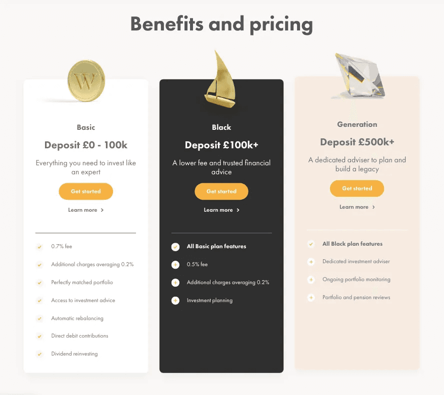
Icons by Wealthsimple
❌ What to avoid
Try not to depict reality but to add your personal touch, stock icons rarely evoke trust or interest:
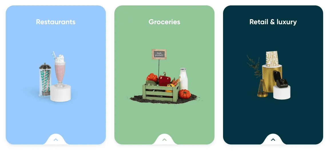
Icons by Stuart
2. Do not mix isometry and 3D perspective icons:
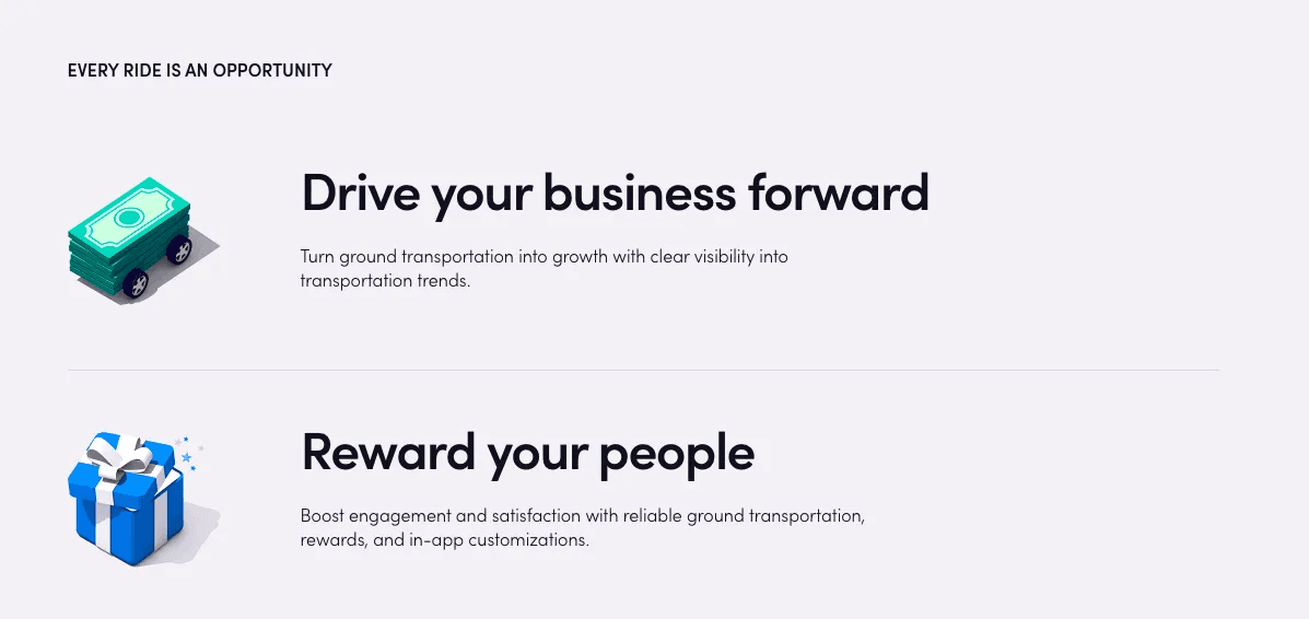
3. Keep in mind that detailed icons should be big enough to recognize them easily:
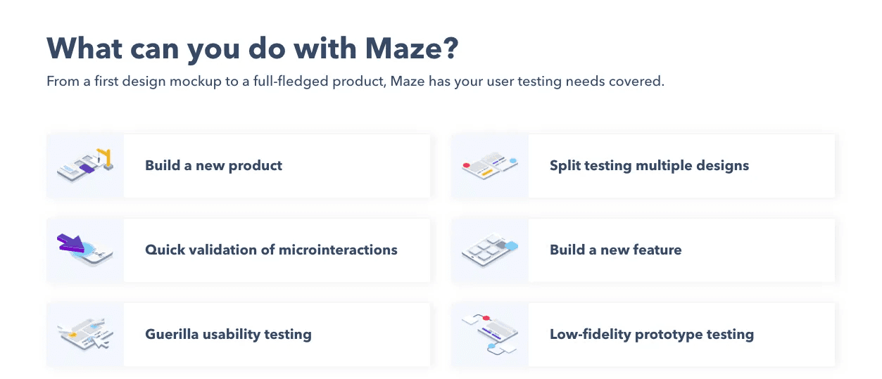
Icons by Maze
6. Minimalist illustrations
Quite easy to find or to create, they will work for any website or application.

Icons by Cocota

Icons by kenchko
💡 Idea
Try to rethink the standard icons and create minimalist versions of them:
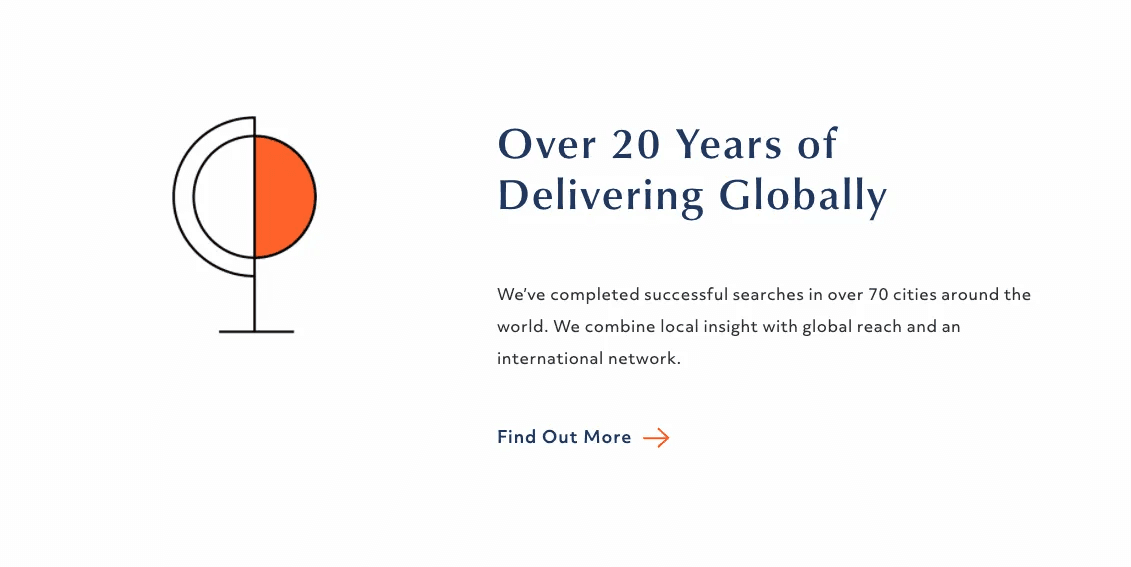
Icons by Dore Partnership
❌ What to avoid
Overly generic graphic templates nobody can relate to.

Zalando icons
7. Filled in illustrations
It’s probably the most widely used style. It might sound like a dull style, yet some companies proved it can be not canned and quite stylish.

Icons by Salesforce
The biggest challenge is to design icons not only supporting your ideas but adding value to the product with an enjoyable and unique look:

💡 Idea
Partially animated icons:
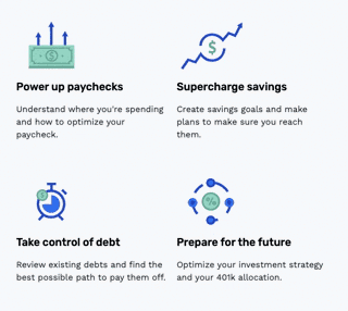
Animated cons from Origin
8. Icons complementing content
Sometimes the icon accompanying the text is a bit unexpected. Uncanned.
If most of your users find it easy to connect the icon with the description, and the icon seems valuable to them, you are on the right track. Making an icon fun or emotional will enhance the overall experience.
Yet sometimes it’s hard to tie the icon to the description or the perception of the icon differs from the main idea of the point it describes:
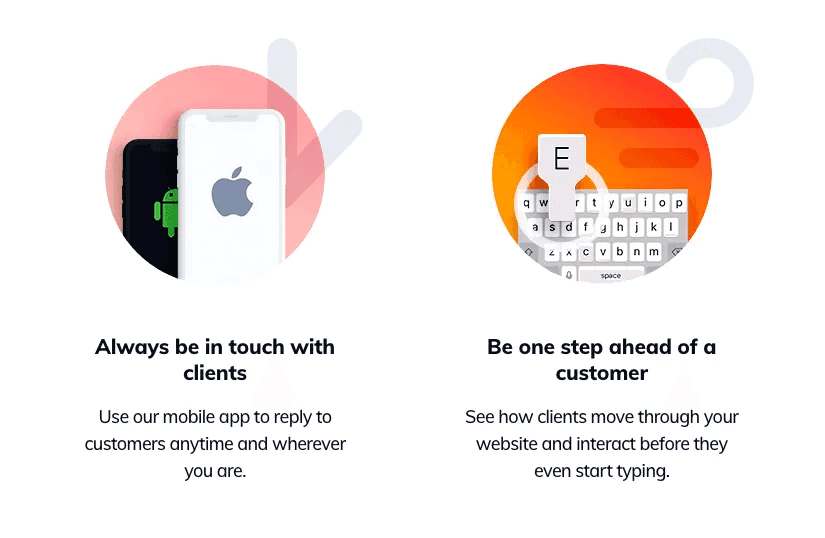
Icons by Tidio
Don’t make people wonder what you wanted to say with this icon. Icons should be absolutely clear, leaving no room for twofold understanding.
Steve Krug: “Don’t make me think!”
9. Custom drawn icons
This type of icon will probably fit not every business, but some product brands may find them useful.
Drawing icons like these requires a certain amount of skills. However, you can try plugins for Photoshop or Illustrator transforming images into sketches and save some time.
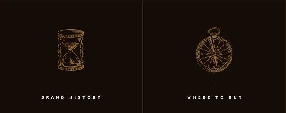
Icons by Polugar
“Curly” icons:
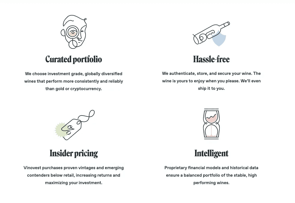
Icons by Vinovest
Changing the style of the brush to hand-drawn chalk can make a huge difference:

Icons by Folk


