From hello to healthy habits: onboarding in healthcare apps
How the best health apps set up success from day one
Let’s start exploring different design approaches and patterns used by leading healthcare applications from signup flows.
Reference usage metrics to build trust
Flo app mentions a number of period cycles it helped to track, a number of reviews with some of the examples, and mentions that your data will be safe.
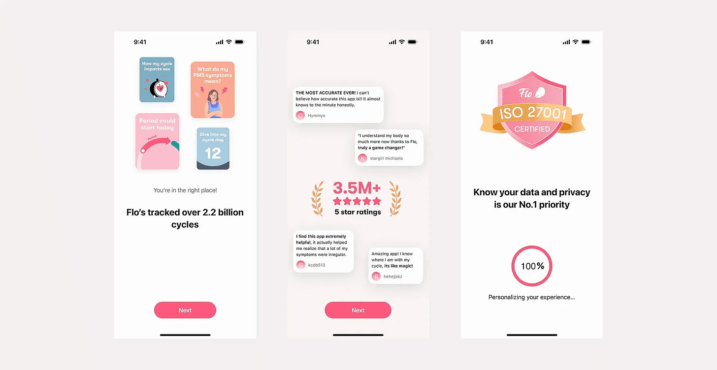
Flo app onboarding
Use numbers to convince
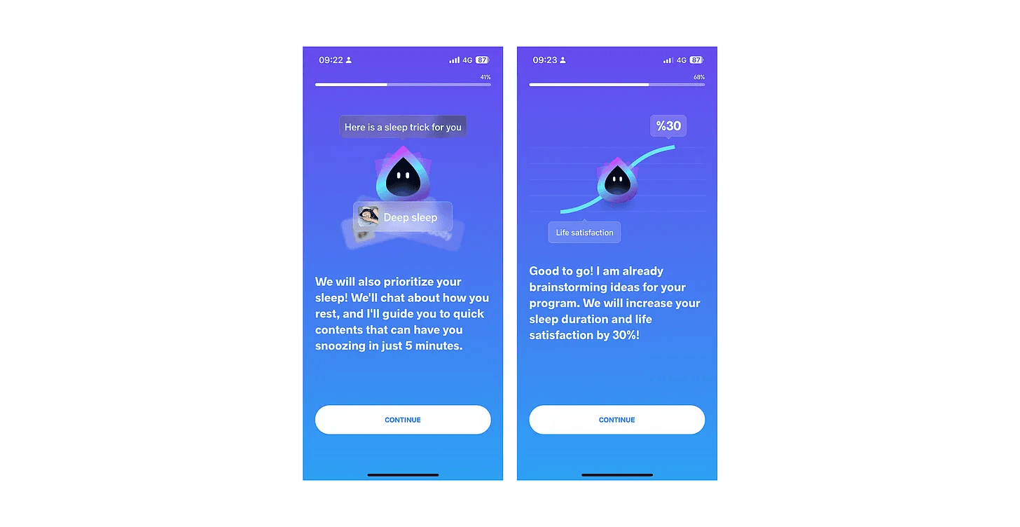
Use numbers to showcase the positive impact your product has on user goals. The Meditopia app tries to show a direct link between sleep duration and life satisfaction. The company makes a promise of “increasing sleep duration and life satisfaction by 30%”.
A better approach might be to show a statistic like “Reduce stress by 20% in just 2 weeks” based on user data or research.
Experiment with different ways to present numbers. Test different statistics, phrasing, and visuals to see what resonates best with your users.
Personalisation and endowment effect
Popular mental health apps Headspace and Meditopia are making personalization questionnaires a big part of the onboarding.
Surveys found that 84% of customers are more likely to buy from a company that provides personalized experiences.
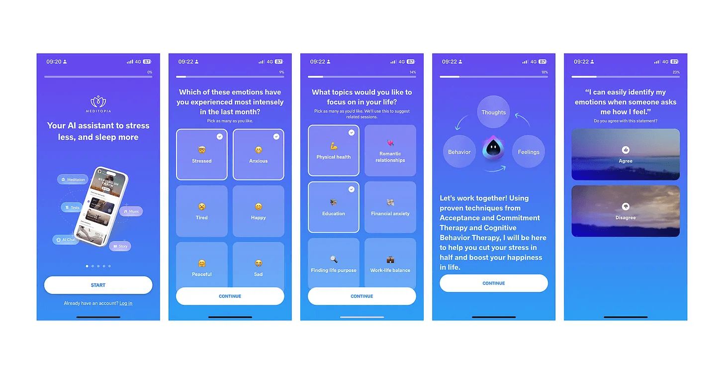
Meditopia app onboarding
The endowment effect describes our tendency to value things more simply because we own them.
Personalization creates ownership: after asking users about their goals and struggles, Meditopia personalizes the app experience. This invested effort creates a sense of ownership in the user’s journey with the app. They’ve put something into it, making them more likely to value it and continue engaging with the app.
Also collecting information such as the goals of the user, current struggles, and priorities helps the product highlight specific features.
Upside:
Creating segments and optimizing user journeys may lead to higher engagement and retention long term.
Downside:
The longer the onboarding and the more information is collected, the lower the rate of users who finish the app will be. Naturally, the drop-off may increase with each step.
Account creation after the questionnaire
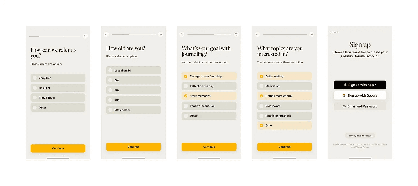
5-minute journal app
When users are prompted to answer a series of personal questions before signing up, it establishes a sense of engagement and investment. This process can make them feel more connected to the platform because they’ve already invested time and effort.
Additionally, by answering questions upfront, users may perceive the sign-up process as more tailored to their needs, increasing their likelihood of creating an account at the end.
Personalised program or plan after account setup
Healthcare apps often suggest personalized plans after setting up the account. They use the information users provide to offer recommendations for improving health.
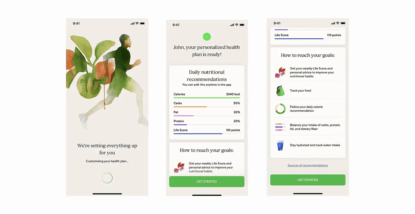
Lifesum app
Upside:
Personalized plans keep users engaged by offering suggestions tailored to their needs, and making it easier to imagine how the app will help them improve.
Downside:
The effectiveness of personalized recommendations depends on the accuracy of the data provided and the algorithm’s analysis.
Notifications case
Most apps ask to turn on the notifications right after signup and only a few do it in a smart not intrusive way. Headspace shows a custom screen with an illustration giving users the ability to choose which notifications to subscribe to:
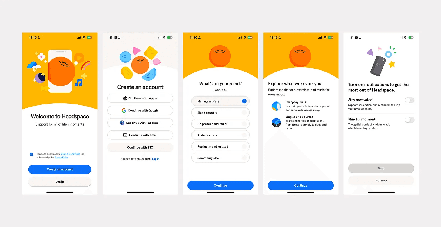
Headspace app signup
Zero app mentions the stats to motivate users to turn on notifications:
Zero users are 26% more likely to build a healthy fasting habit when they enable notifications.
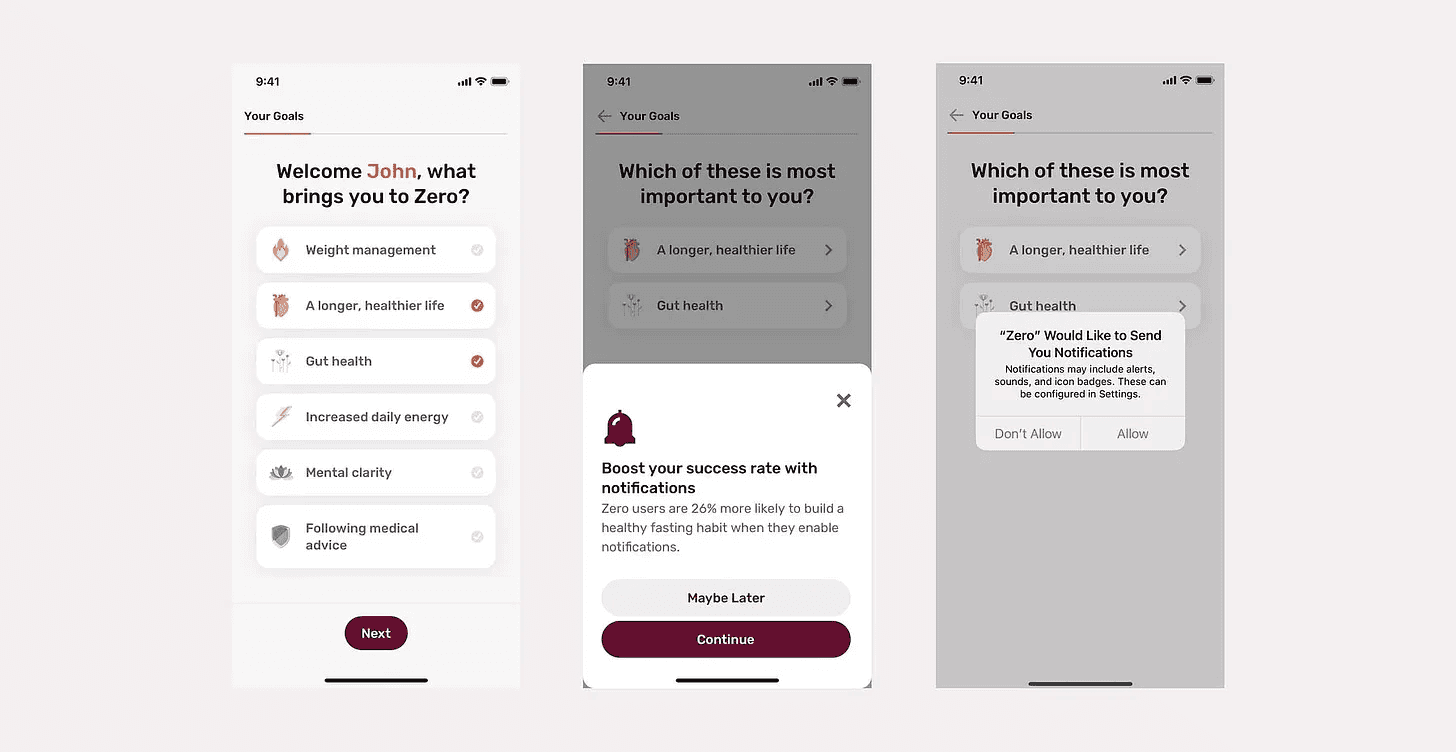
Zero app
Product demo
A short demo of the product such as a breathing exercise on Headspace helps to showcase the value of the product upfront.
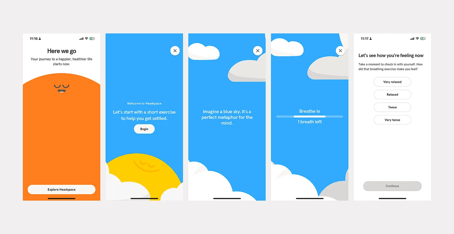
Headspace breathing exercise
Upside:
When the majority of the content is not available for free users, the “wow” effect during onboarding possibly can help them get interested in exploring the trial. With quick breathing exercises or soothing music upfront, users immediately experience the app’s benefits. This simple showcase helps build trust and encourages users to explore further, promoting long-term engagement with the app.
Moreover, a user feels a sense of accomplishment when the task is finished successfully — in the case of Headspace, meditation is done. The cognitive design principle is called a peak-end rule.
Downside:
The more time a user spends before extracting value from the product the bigger drop-off can be expected.
Chat-based interactive learning about the app
BetterSleep stands out by using a chatbot during onboarding, a fresh approach compared to other apps. Instead of static instructions, the chatbot engages users in conversation, making the process more interactive. Chatbot highlights key app’s benefits, and clarifies how the app works. By talking with the chatbot, users may be more likely to remember and understand the app’s features.
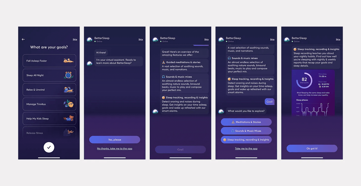
BetterSleep onboarding chat
Paywalls
Imagine a user just dipping their toes into the app. A paywall at this stage can feel like a chasm they’re not ready to leap.
After signing up for most mental health apps, users will likely see a paywall. The key is designing this paywall to encourage upgrades without being intrusive.
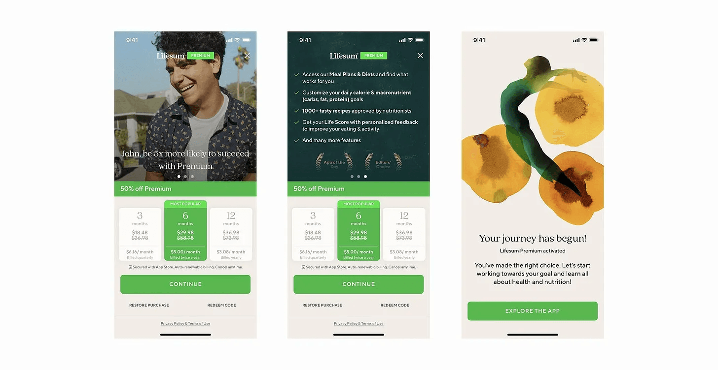
Lifesum paywall
A paywall during onboarding might deter users who are just exploring the app and haven’t fully experienced its value yet.
Offering a trial period before the paywall can be a good compromise. It allows users to experience the full functionality of the app before deciding whether to subscribe or not. This approach can lead to higher conversion rates as users are more informed about what they’re paying for.
Offer upgrade options at relevant moments in the user journey, when the value of premium features is most apparent.
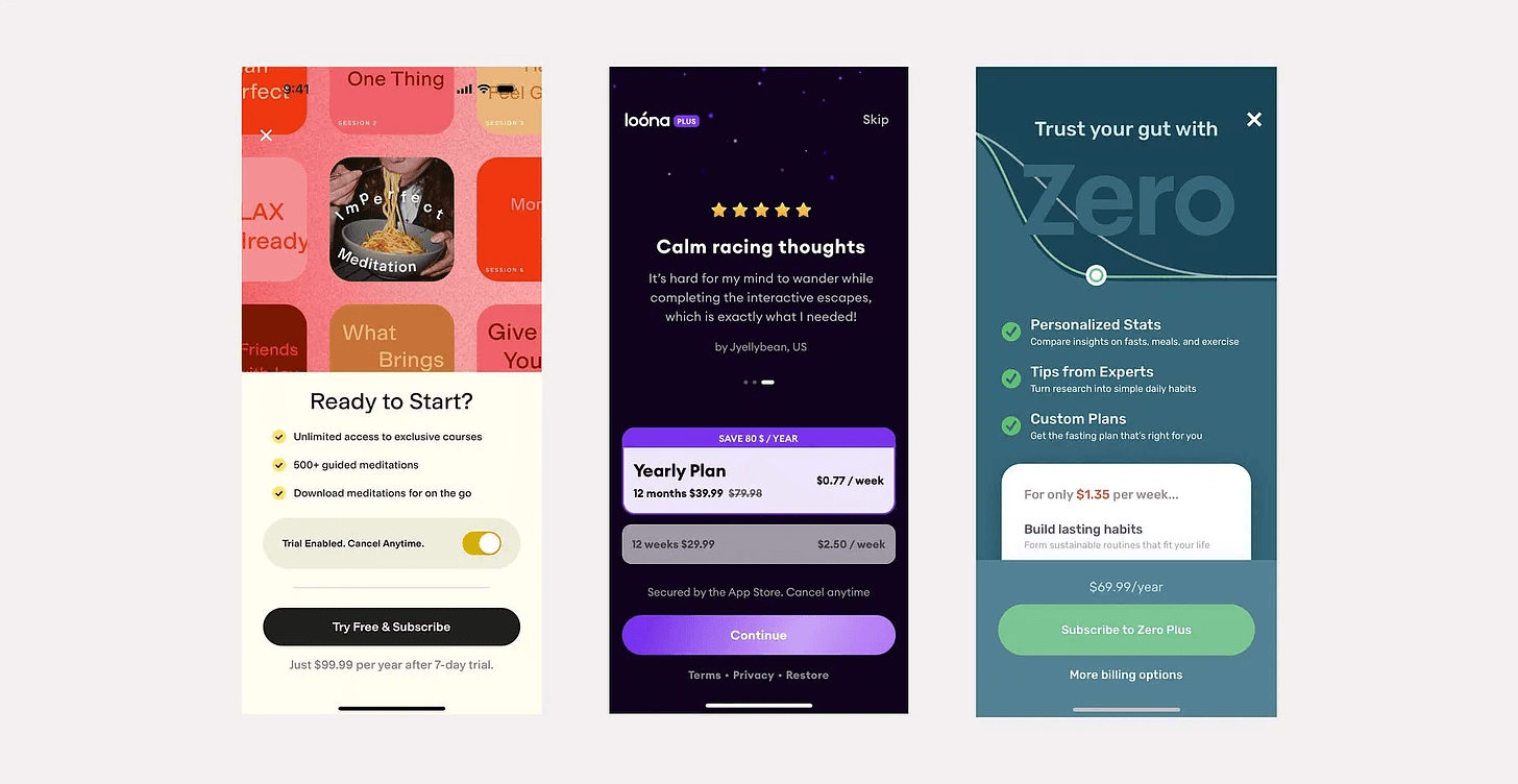
Loana and Zero paywalls
Another approach widely used is breaking down prices into weekly costs, e.g. instead of “69.99 yearly” communicating “only $1.35 per week”. It makes the subscription seem more affordable, which can increase conversion to paid.
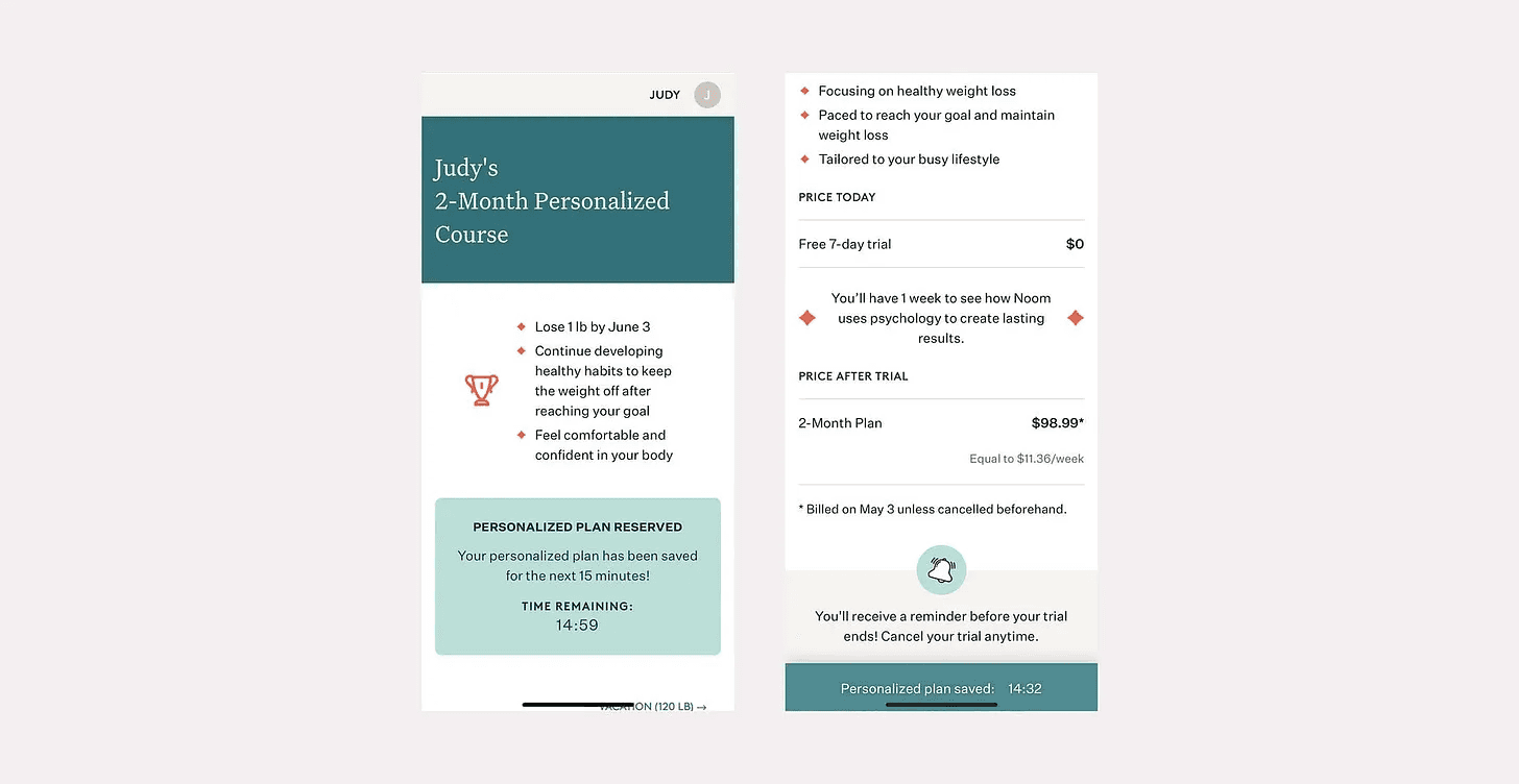
Noom app
Noom app for weight management generates a personalized plan based on an extensive list of questions and suggests a free trial and 2-month plan to achieve the goal set by a user. Interestingly, they also use a 15-minute timer to push a user to an impulsive action of committing to the program and subscribing so as not to lose the personalized plan they spent minutes answering questions for.
Key takeaways
In this article, we have covered the design approaches top healthcare applications use to sign up and onboard users and then convert to paid.
Build trust: emphasize trust by referencing clinical backgrounds and data security practices.
Personalize: tailor experience in the app based on user goals and pains, and draft personalized programs if possible.
Friction reduction: shorter signup processes and placing account creation after questionnaires can improve user engagement.
Show product value early: do mini-product demos to build interest.
Smart monetization: paywalls should be non-intrusive, with trial periods and clear pricing.
