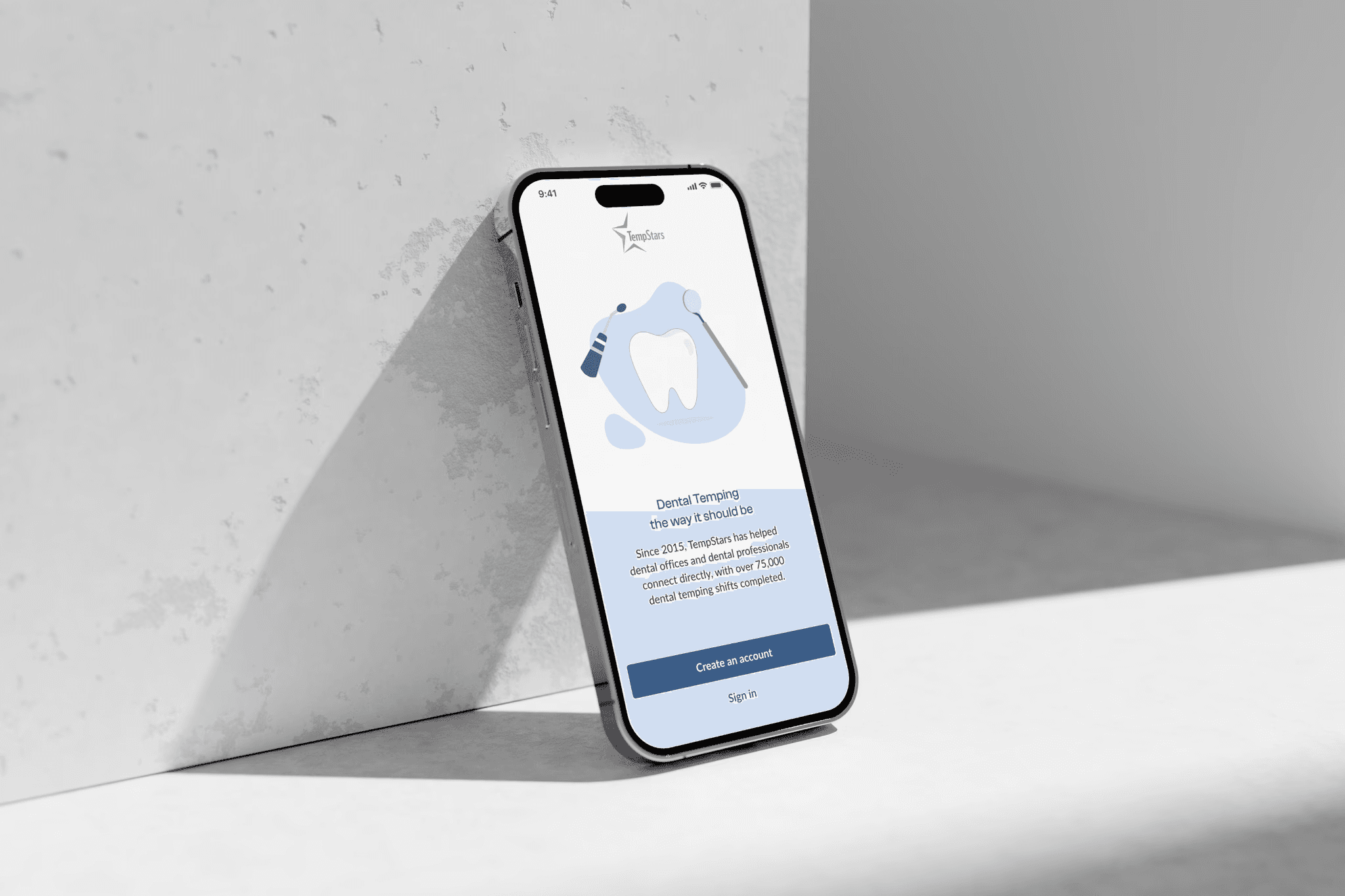
TempStars is a dental temp app to quickly and easily find and match hygienists & assistants with dentist offices who need them short-term while their permanent employees are out of the office. Serving over 10,000 dental offices and connecting them with more than 24,000 dental professionals, TempStars is one of Canada's largest dental hiring services.
Low activation and retention
TempStars faced low activation and retention rates, with many users signing up but not engaging with the platform. Additionally, the UI design, created over five years ago, was outdated and inconsistent. Our goal was to improve the activation rate and refresh the user interface to create a cohesive and modern experience.
TL;DR:
- We contributed work that led to a 125% increase in booked shifts. My work focused on accessibility, performance, and improving the booking experience,
- Redesigned user onboarding leading to increased activation (30%),
- Led extensive foundational research to build a shared understanding of user needs, personas, and journeys in the team,
- Led collaborative workshops to shape a solution and foster design thinking in a team,
- Designed a new design system yet preserved a familiar UX logic to avoid breaking habits.
Research insights:
Most users don't work even one shift
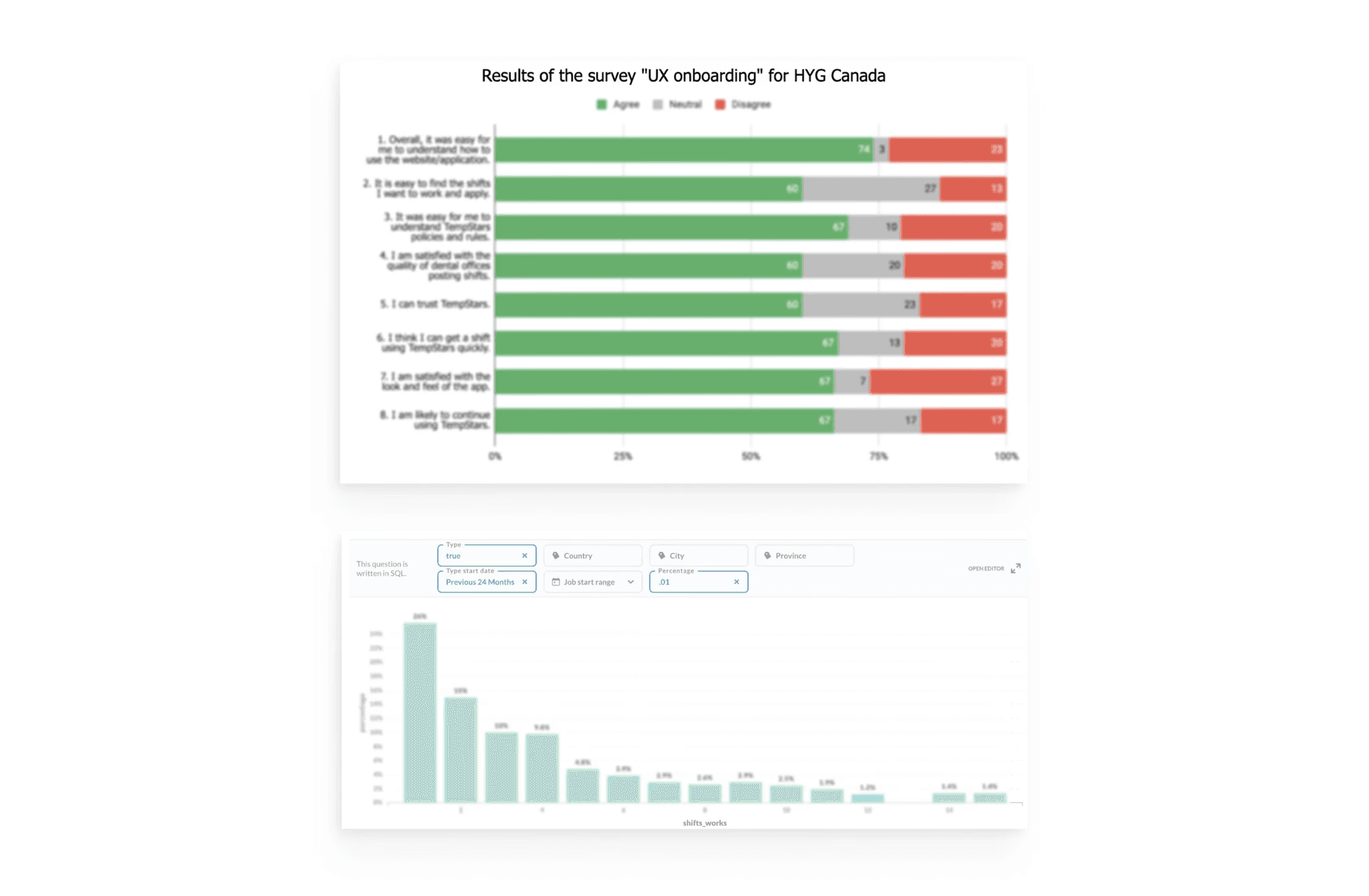
The most significant drop-off in user engagement occurred in the early stages of the user journey. After registration, more than 40% of users did not interact with the app at all, and over 59% of users dropped off after receiving their first work offer.
Confusing navigation
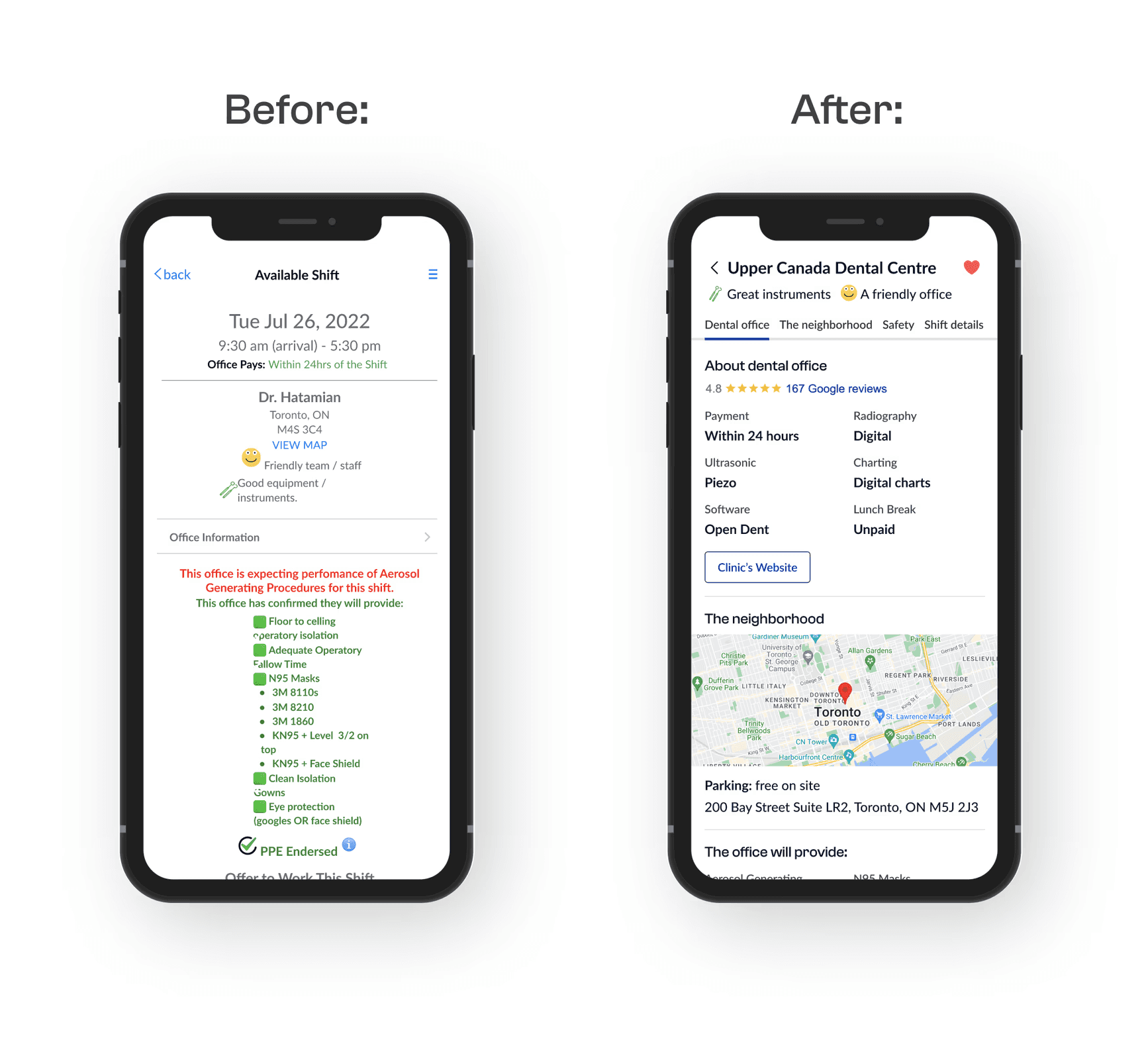
The biggest usability issue based on the survey was related to the search for the optimal shift. Only 60% mentioned they find this task easy. Hygienists spent a lot of time checking shift pages to see the key info hidden at the very bottom.
Missing information
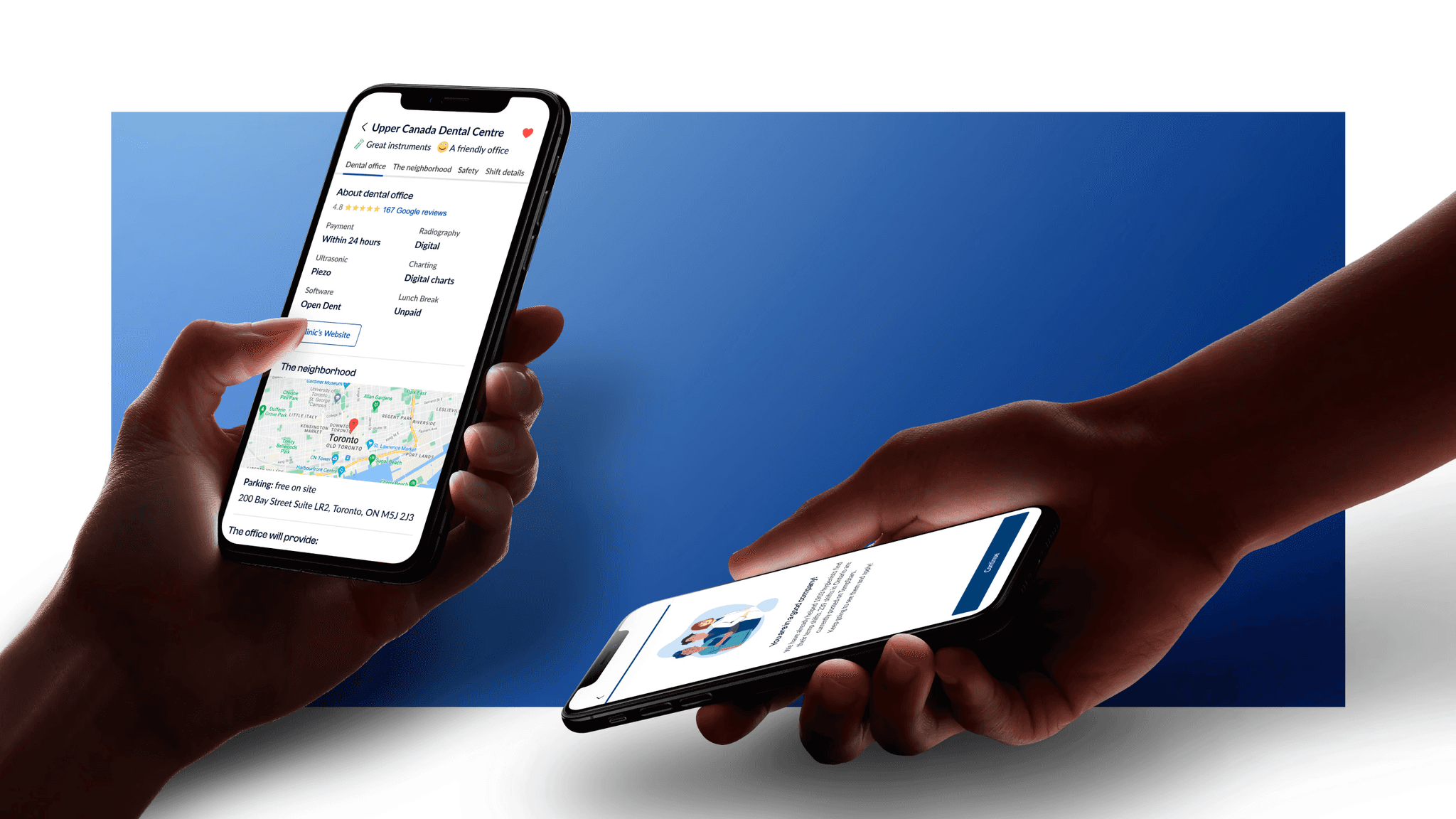
Users found it challenging to understand if the clinic was a good fit for them. They needed to leave the app and google the info about the dental clinic before sending their proposal.
Complicated rules and lack of trust
Only 60% of users mentioned they find it easy to understand the rules and policies. Users didn’t fully understand how the system works and didn’t trust it.
Solution design
Restructured shift page with enriched context and easy navigation
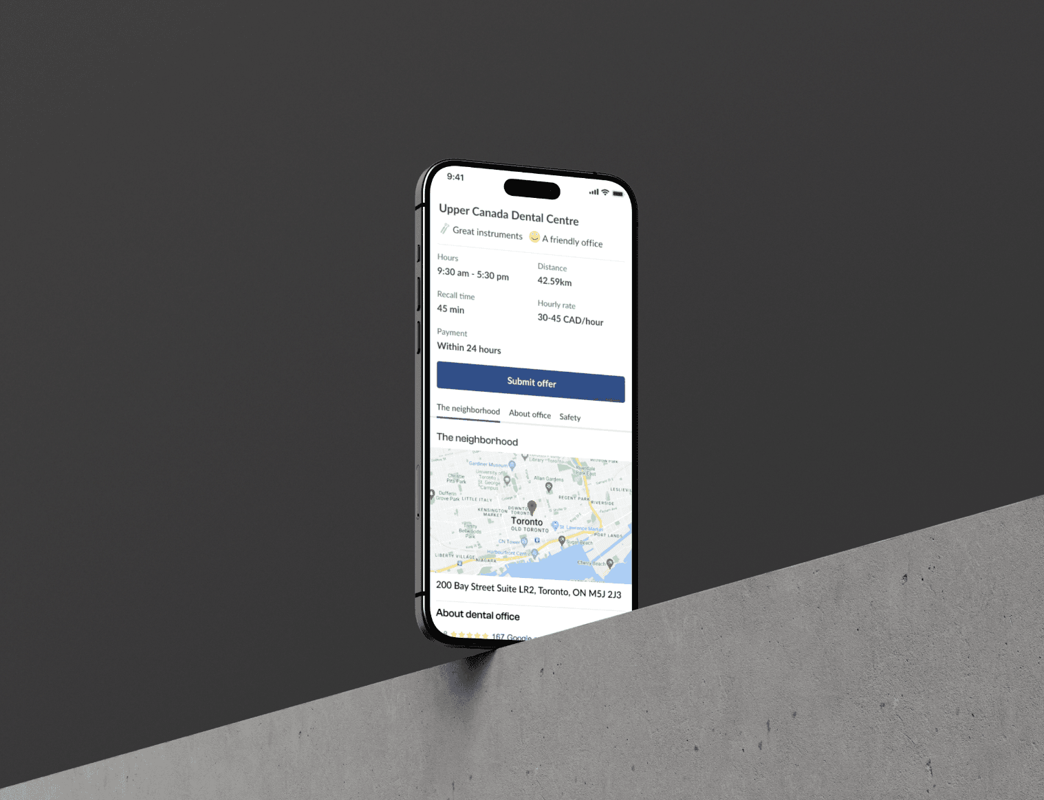
After a few rounds of testing and redesigning, we landed on a new optimized shift page: it included all the necessary information to make a decision, the hierarchy was logical, and navigation was simplified.
Enriched and redesigned the signup flow for personalized user experience in the app
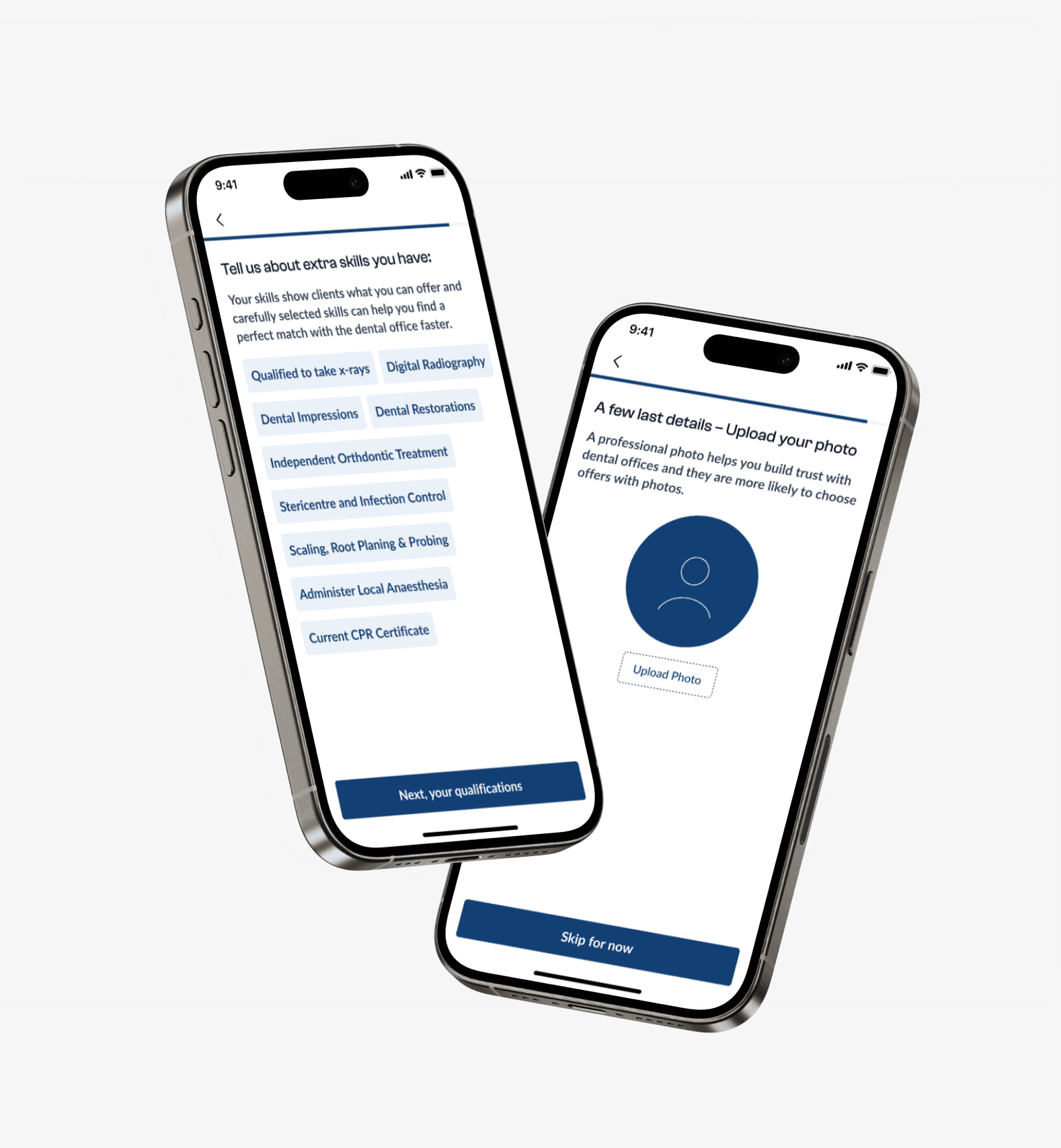
The research proved that users with some specific skills often apply only to the jobs that require these unique skills. By collecting this information from the workers upfront, we could show the relevant shifts on top making the match seamless.
Introducing user onboarding and simplifying the rules
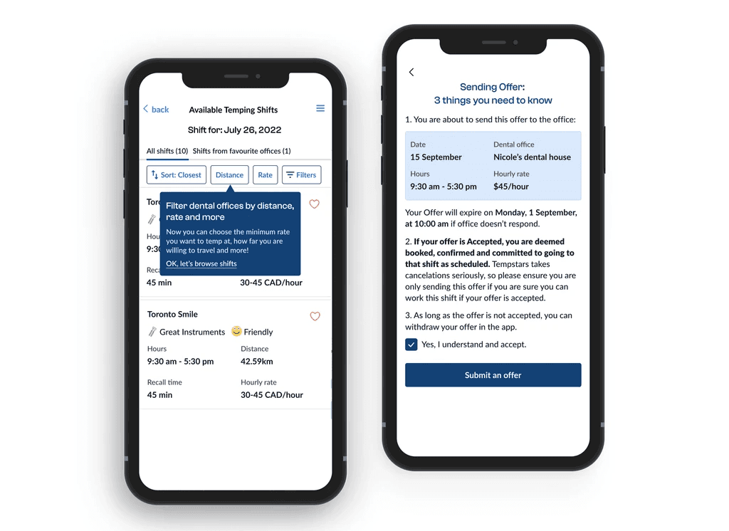
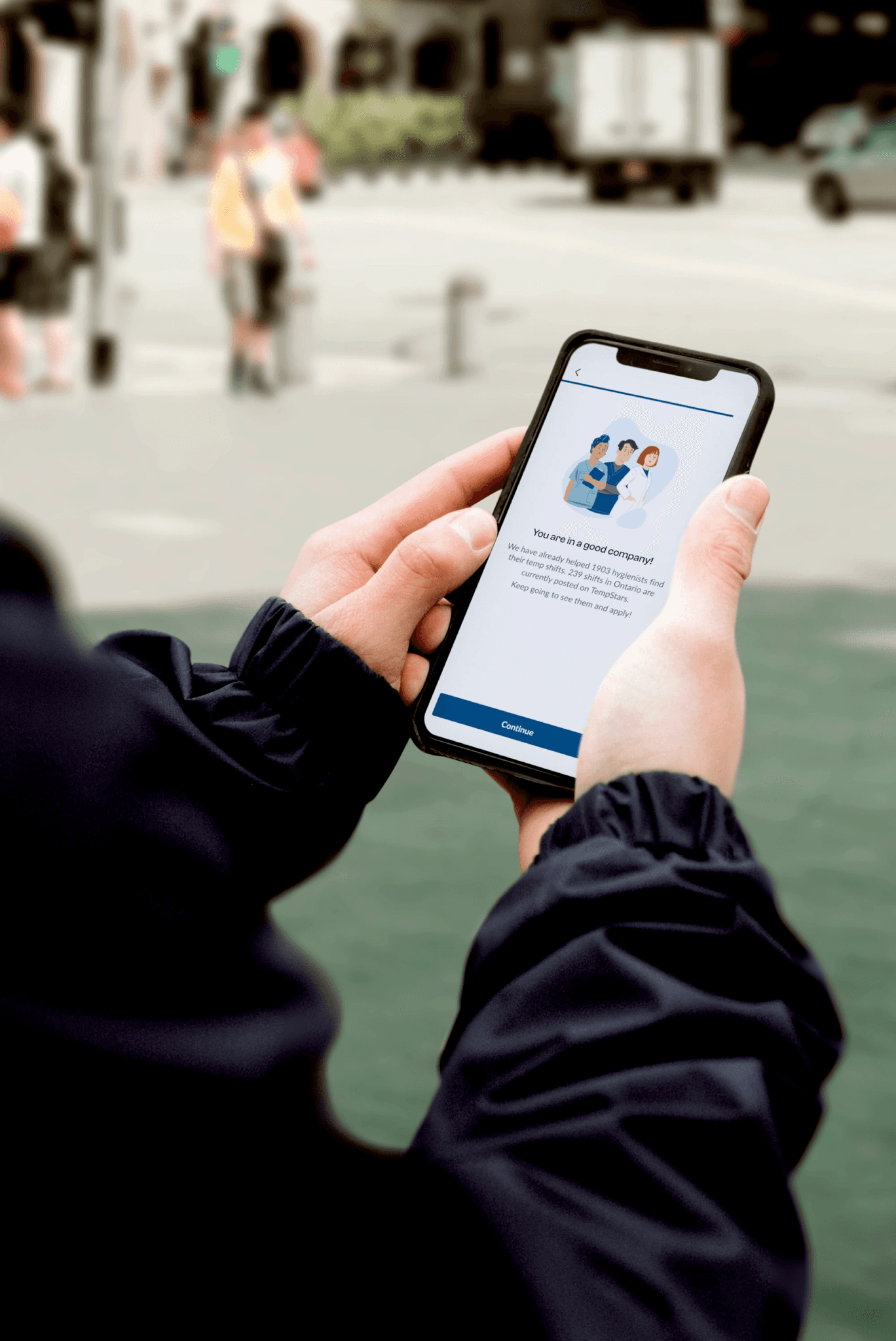
Step-by-step explanations of the rules after signup and shift application helped users understand the next steps in the process, and what rights and responsibilities they will have.
Personalized shift recommendations and streamlined shift selection
Introducing the filters and applying some of the filters based on the onboarding form answers helped us personalise their journeys and suggest the optimal shifts for work.
A little bit of magic
I wanted to make the formal and neutral app more engaging and fun for dentists. We reshaped our tone of voice, making our language more friendly and simple. We have compiled illustrations with dentists to spruce up the flows.
Not just UI or Backoffice changes
One of the biggest challenges for us in this project was to change not only the visual presentation of the rules and policies but also their content. Rules often benefited the clinics more and giving dental professionals more transparency meant much higher respect from them and better brand image long term.
After a number of discussions in a team we decided on the alterations to the rules which were perceived as the most untrustworthy: cancelation policy. We expanded the reasons why a dentist may cancel a shift and not get blocked by us. Also we have expanded the reasons why a dentist may want to cancel a shift after arrival to a clinic.
Design exploration
Mapping onboarding and redesigning shift pages
We have tested different variants of the shift page and listing of the shifts.
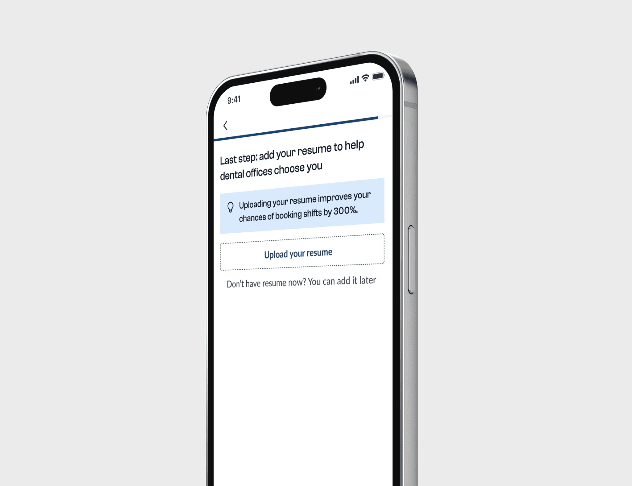
On top of that, we decided to also redesign signup and onboarding to tackle the issues discovered during research. Upon consideration of the different variants of onboarding designs, we decided to choose progressive info disclosure. We didn’t want to overwhelm our predominantly non tech savvy users right away but needed to guide them step by step.
Restructured shift page with enriched context and easy navigation
After a few rounds of testing and redesigning, we landed on a new optimized shift page: it included all the necessary information to make a decision, the hierarchy was logical, navigation was simplified.
Impact
The application is still in development and here are the early results after the beta launch:
- Primary metric: a percentage of activated users (users who worked at least one shift) grew by 30%;
- We contributed work that led to a 125% increase in booked shifts;
- The time to send an offer was reduced from 7 days to 2 days on average;
- We got rid of the immature feeling and give TempStars a more mature appearance;
- Created a consistent experience across the app.
